
About Me
Hello! I’m Jorge Solares, a Data and BI Analyst with a passion for creating meaningful reports and visualizations for data-driven organizations.In today’s resource-constrained environment, I focus on delivering actionable insights that drive business outcomes. My expertise lies in identifying key trends and patterns that help enhance efficiency, reduce costs, and deliver measurable results.I’ve empowered companies and business owners to make confident decisions by guiding them through budget management, payroll optimization, and marketing strategies with data-driven solutions.
Skills

Excel | SQL | Tableau | Power BI
Data Visualization - 3+ years
Business Analytics - 10+ years
Team Management - 10+ years
Report Development - 3+ years
Certifications

Google Analytics Certificate | Issued 2023

eCornell Digital Marketing Certificate | Issued 2021
Featured Projects

| Power BI |
Revenue Analysis Dashboard
This Power BI dashboard provides key business insights, tracking revenue, transactions, returns, and performance against target goals to help drive data-driven decision-making and optimize operations.
| Excel |
Regional Revenue Analysis Dashboard
Optimized workflow by creating a dashboard to guide communication of revenue data


| Excel |
HR Analytics Insights
Conducted people analytics to gain insights into company engagement and identify areas for improvement
| Excel |
Labor and Wage Dashboard
Developed an interactive dashboard to display employee density and salary trends by industry


| SQL | Tableau |
Retail Store Insights Report
A retail dashboard highlighting client demographics to facilitate data-driven decision-making
| Tableau |
Churn Rate Analysis
Churn Analysis of a telecommunications company


| Excel |
Coffee Shop Dashboard
Enhanced guest experience through strategic staffing, scheduling recommendations, and efficient inventory management
| Power BI |
Revenue Analysis Dashboard
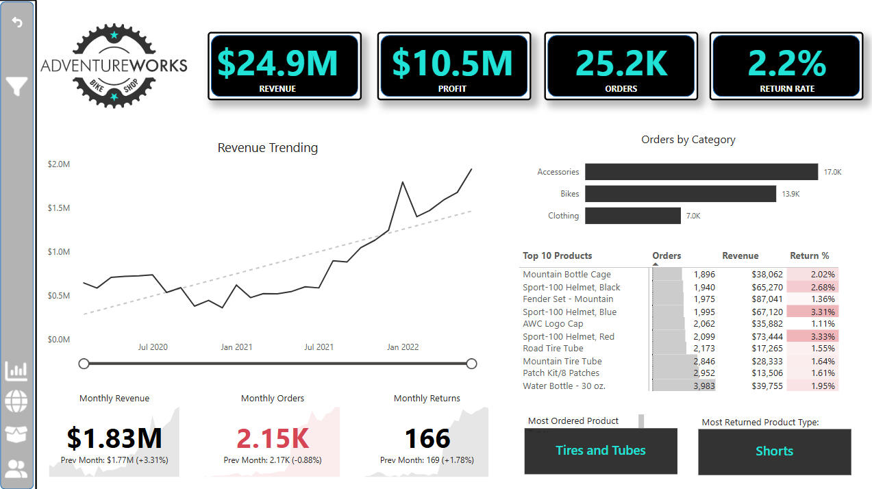
Objective
The goal of this dashboard was to provide a clear, interactive view of key business metrics, including revenue, transactions, returns, and target goals. By visualizing these data points, the dashboard supports data-driven decisions to optimize sales, reduce returns, and track performance.Data Overview
The dataset includes sales, transaction, return, and target goal data. It combines multiple sources, such as transaction logs, return records, and product categories. The data was cleaned and transformed to ensure consistency and accuracy.Dashboard answers the following business questions
What are the current revenue and transaction trends?
How do returns impact overall revenue and performance?
Are target goals being met for revenue and transactions?
Which product categories drive the most revenue?Dashboard Development Steps
Data Extraction: Data was gathered from various sources and imported into Power BI.
Data Cleaning: The data was cleaned and transformed using Power Query to ensure consistency.
Data Modeling: Relationships were created between tables for smooth analysis.
DAX Calculations: Custom DAX measures were built to calculate return rates, revenue, and performance against goals.
Visualization: Power BI’s charts, matrices, and KPIs were used to design the final dashboard.Dashboard Features
Interactive Visuals: Line charts to track revenue and transactions over time.
KPIs: Key metrics like revenue, transactions, and return rates, compared to target goals.
Return Rate Analysis: Shows return rates by product category and period.
Order Category Breakdown: Matrix view displaying revenue and transactions by product category.
Goal Comparison: Visuals showing performance against target goals for key metrics.Outcome
The dashboard provides clear insights into the company’s performance, highlighting trends, return rates, and target goal progress. It helps management teams identify areas for improvement and make more informed decisions to drive growth and efficiency.
| Excel |
Regional Revenue Analysis Dashboard
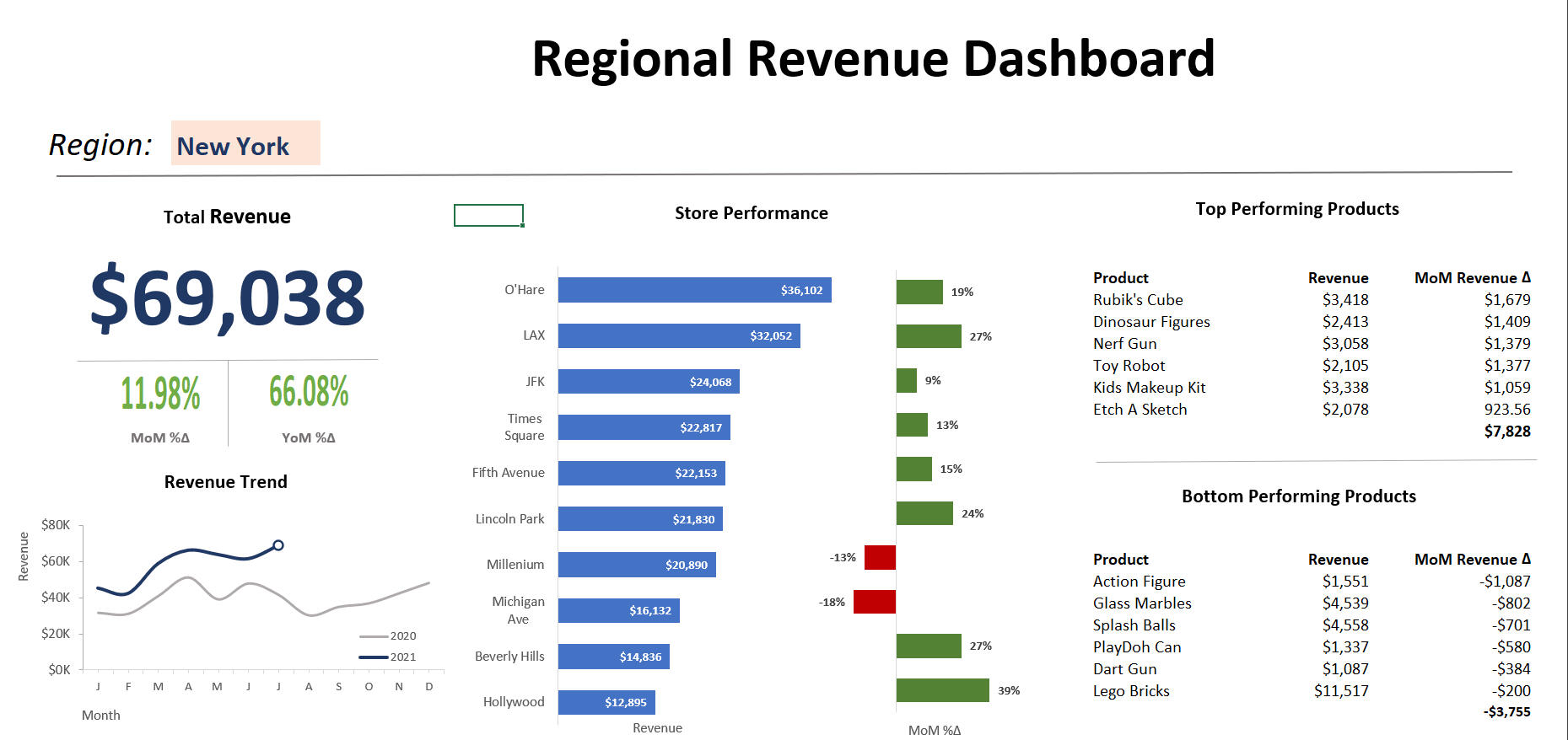
Objective
Streamline monthly meetings which have been lengthy and disorganized due to varying metricsData Overview
The dataset comprises sales data including revenue, profit, category, region and location.Dashboard answers the following business questions
-What is total regional revenue and its year-over-year trend?
-What is this month's total revenue by region and how does it compare with the previous month?
-How are the individual stores revenue performing vs previous month?
-What are the top performing products driving the most revenue? -Which ones are bringing the least revenue?Dashboard Development Steps
-Used Excel to review for duplicates and nulls to process 5,000 rows of data
-Created a separate tab for filters and categorization
-Utilized a Data Prep tab to apply filters, formulas, and calculated fields
-Designed charts to answer each business question
-Used formulas for dashboard to be dynamic and can intake new data
- Some formulas used include SUMIFS, INDEX, MATCH, RANK, MAXIFS, IF, XLOOKUPDashboard Features
-Region-based filters for quick sorting of information
-Core KPIs prominently displayed.
-Custom line chart comparing current year balances with the previous year
-Bar chart illustrating individual store locations and month-over-month percentage changes, with color-coded highlighting for positive and negative trends
-Identification of top and bottom revenue-generating itemsOutcome
-Dashboard can significantly shorten monthly meetings. It can enhance leadership accountability with guiding action plans aligned with dashboard KPIs
| Excel |
Coffee Shop Dashboard
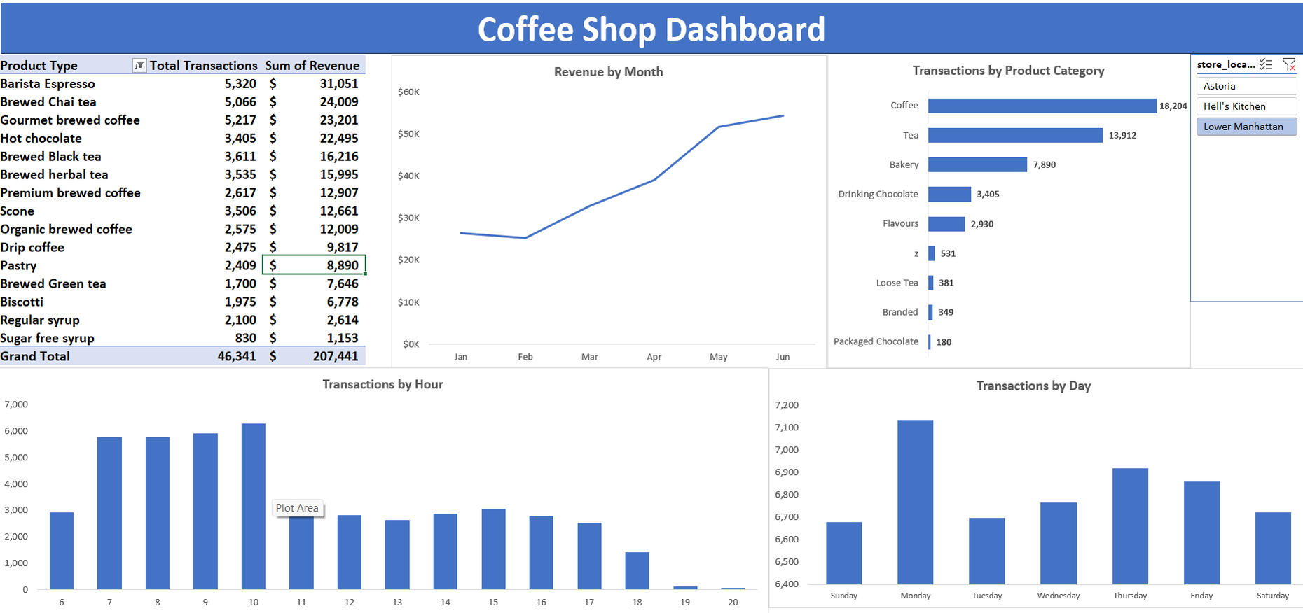
Objective
To enhance guest experience by analyzing trends to optimize staffing allocation, payroll, and inventory management for coffee shops.Data Overview
Transactional data from point-of-sale systems was utilized, including revenue, product category, store location, transaction date, and time.Dashboard answers the following business questions
-What are the top-selling products?
-Which products sell the least?
-How are sales trending for the year?
-What are the peak selling times and days?Dashboard Development Steps
-Used Excel to process over 140,000 rows of data to remove duplicates, nulls, and formatting issues
-Extracted hour and day from transaction timestamps
-Aggregated data using Pivot Tables
-Created Pivot Charts to convey analytics
-Tied charts to a slicer identifying selected storeDashboard Features
-Store-based filters for easy sorting
-Line chart depicting yearly sales trends by month
-Bar charts displaying sales distribution by hour and day
-Identification of top and bottom-selling items
-Slicer toggles between storesRecommendations
-Celebrate positive sales growth across all stores!
-Prioritize stocking espresso and chai tea to meet customer preferences. Minimize inventory of less popular items such as sugar-free syrup, regular syrup, green tea, and biscotti to reduce dead costs
-Lower Manhattan should adjust staffing to meet peak demand on Mondays, reallocating resources from Sundays and Tuesdays, focus staffing during high-demand hours of 7am-10am
-Hell’s Kitchen should reallocate resources from Saturdays to peak days of Tuesdays, Sundays, and Fridays. Adjust morning service hours from 8am-10am for optimal staffing
-Astoria should increase staffing on Mondays, Wednesdays, Thursdays, and Fridays to accommodate peak hours from 7am-10am, while reducing resources on low-transaction days of Sundays, Saturdays, and Tuesdays.
| Excel |
Labor and Wage Dashboard
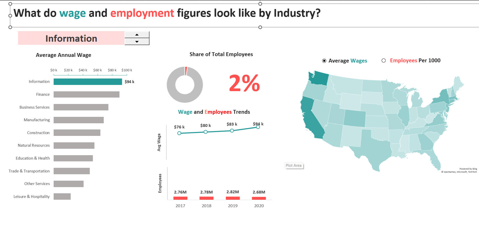
Objective
Develop a dashboard showcasing career and salary trendsData Overview
The dataset spans 4 years and encompasses 10 industries, each associated with states, average salaries, and employee counts.Dashboard answers the following business questions
-What are the average annual salaries by industry?
-What is the proportion of employees in each industry compared to the total?
-How has salary and employee count trended over the past 4 years?
-What state has the most density in terms of employees per industry?Dashboard Development Steps
-Used Excel to review duplicates, nulls, and formatting issues for 2,000 rows of data
-Created a separate tab for data transformation
-Developed a Data Prep tab to establish filters and calculated fields
-Avoiding pivot tables and used formulas-based formatting for more customization
-Designed visualizations to address each business question
-Used color to drive stories
- Some formulas used include AVERAGEIFS, SORT, SUMIFS, INDEX, MATCH, RANK, MAXIFS, IF, Dynamic ArraysDashboard Features
-Industry-based filters with color-coded visualizations for effective comparison
-Line chart illustrating salary trends over the last 4 years
-Geographical map displaying employee density across the U.S.
-Bar charts presenting average salary by industryExploratory Insights
-The Information industry boasts the highest average salary but holds the lowest share of employees
-Trade & Transportation and Education & Health sectors have the highest employee shares
-Finance is centralized in the Northeast U.S., Information in the upper Northeast, and Natural Resources in the Midwest U.S.
| SQL | Tableau |
Retail Store Insights Report
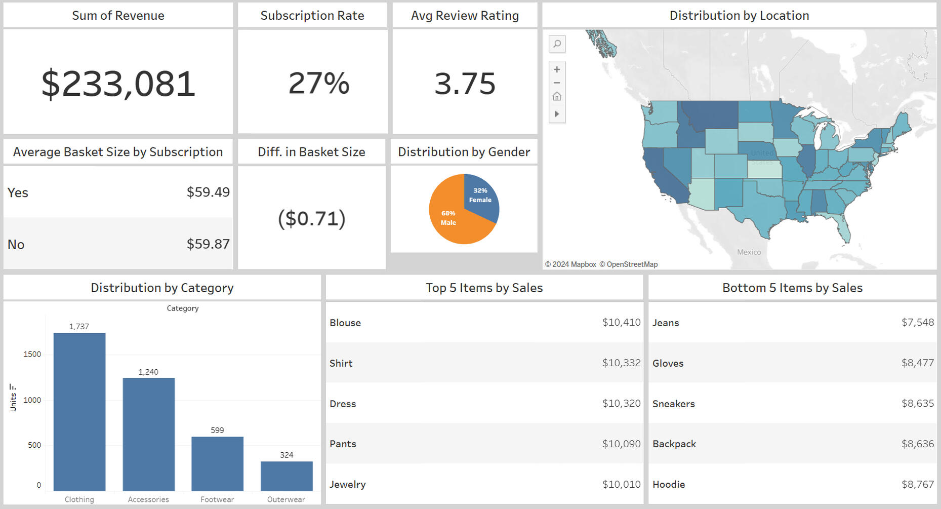
Objective
Create a report to convey retail data in easily digestible insightsData Overview
The dataset includes individual purchase information, along with gender, location state, and retail category detailsDashboard answers the following business questions
-What is the total revenue?
-What is our subscription rate?
-What is our overall satisfaction rating?
-Do subscribers spend more than non-subscribers?
-Which category is driving the most sales?
-What are our top and bottom selling items?Dashboard Development Steps:
-Imported data into MySQL, reviewed for duplicates, nulls, and field formats
-Performed aggregate functions to using GROUP BY statements
-Imported data into Tableau
-Created visualizations to address each business questionDashboard Features:
-KPIs positioned in the top-left for quick access to key metrics
-Bar charts displaying the distribution and quantity of sales by category
-Geographical data visualization showing purchaser density
-Text tables highlighting top and bottom-selling itemsRecommendations
-Subscription status does not yield higher basket sizes. Implement targeted discounts for subscription holders to increase sales and raise brand loyalty.
-California, Idaho, and Montana for are driving the most sales. Targeting ads to these guests can yield the most marketing ROI.
- Women's blouses and dresses are huge sales drivers.Keeping inventory on-hand and timed sales can continue driving growth.
-Jeans, gloves, and sneakers are among the lower producers. Review assortment and consider limiting assortment to allow for higher sales drivers like dresses and blouses
| Tableau |
Churn Rate Analysis
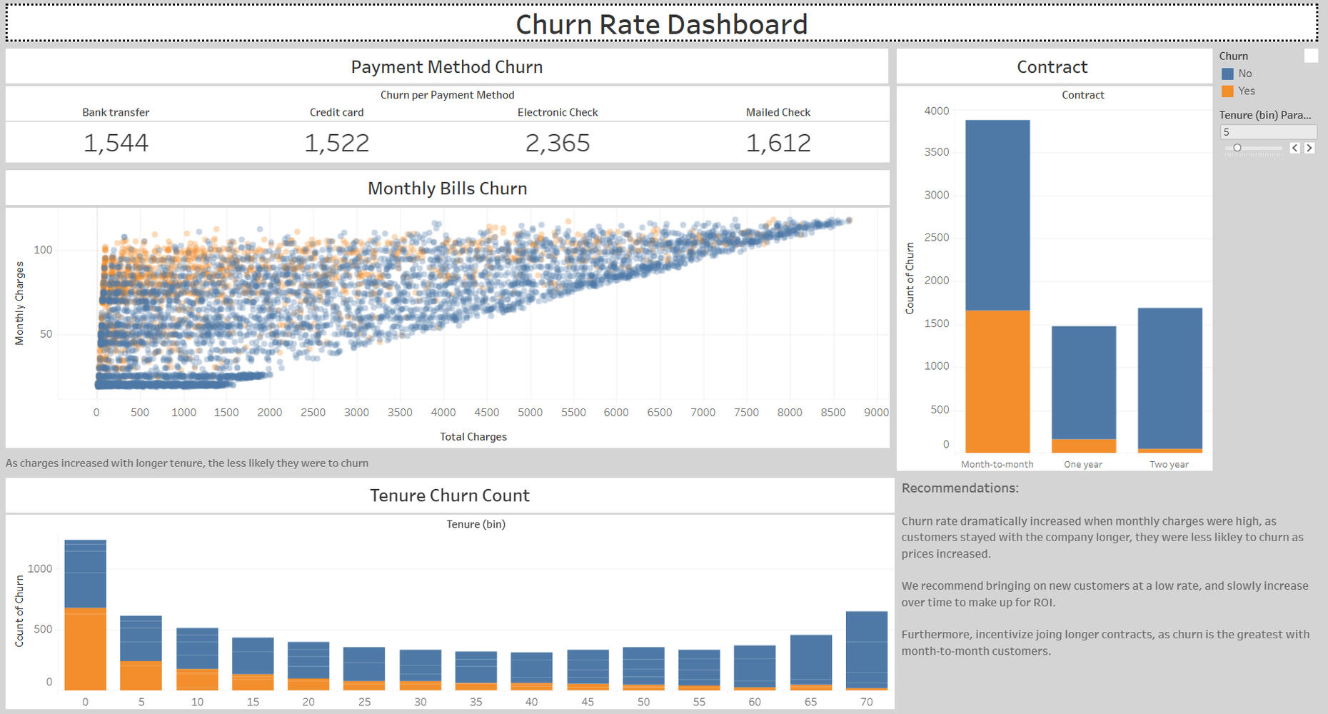
Objective
Review data from a telecommunications company to derive insights for reducing customer churn.Data Overview
The dataset includes customer IDs, service plans, contract types, monthly charges, total charges, and other relevant information.Dashboard answers the following business questions
Determine if there is a correlation between payment types and higher churn.
Analyze the relationship between churn and total charges.
Assess how contract length contributes to churn rates and identify critical points.
Examine the influence of contract types on churn rates.Dashboard Development Steps
-Import raw data from Excel into Tableau, reviewed for duplicates, nulls, and field formats
-Created calculated fields and extracted month data from dates
-Developed individual tabs for each visualization to answer each questionDashboard Breakdown
-KPIs indicating churn by payment type
-Scatterplot shows churn by total charges, with color differentiation to highlight patterns
-Area bar chart displays tenure by years, color-coded to show proportions
-Bar chart categorizing contract typesInsights and Recommendations
-Churn rates increase significantly with higher monthly charges; However, customers tend to stay longer despite rising prices.
Introduce customers at a lower charge and gradually increase prices to improve ROI.
-Month-to-month contracts have the highest churn risk. Incentivize longer contract commitments to reduce overall churn.
| Excel |
HR Analytics Insights
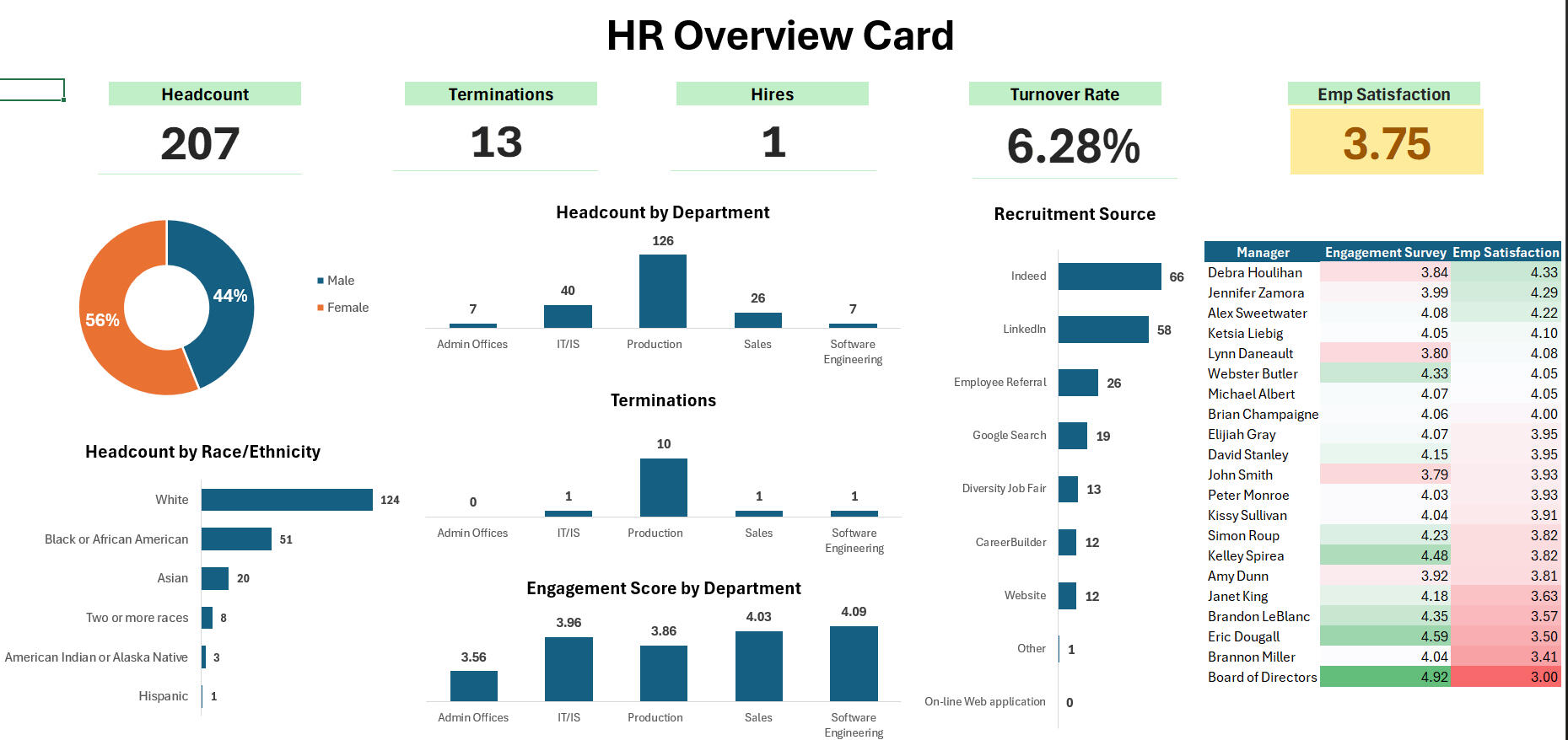
Objective
Use people analytics to gather insights into employee engagement, retention, and recruitmentData Overview
The dataset includes employee details such as name, gender, engagement scores, supervisor name, title, department, salary, hire date, termination date, termination reason, recruitment source, and more.Dashboard answers the following business questions
-Where is our total headcount, terminations, hires, and turnover rate?
-What is our distribution of employees by race and gender?
-Which recruitment source yields the highest retention?
-What are each department's engagement score, headcount, and terminations?
-How is each manager doing with engagement scores?Dashboard Development Steps
-Used Excel to review for duplicates, nulls, and field formats
-Extracted month from termination and hire dates for aggregation
-Created visualizations to address each business questionDashboard Breakdown
-KPIs for company headcount, terminations, hires, and current turnover rate
-Visualizations to convey demographic details
-Bar chart categorizing recruitment sources
-Text tables with color scales highlighting engagement by individual managersRecommendations
-Celebrate that women represent 56% of the company!-Minority representation can use improvement.
Action: Identify and target minority candidates during hiring and recruitment. Use promotion pipelines to enhance minority representation in leadership positions. LinkedIn and Indeed provide the highest retention rates.-Low engagement is prominent in the production department:
Action: Send a follow-up survey to connect further with the production department and guide action planning.-Enhance overall company engagement:
Action: Form focus groups by supervisor of lowest engagement scores to develop action plans,
Begin with Brandon Miller, Eric Dougall, Brandon LeBlanc, and Janet King, as they significantly impact company engagement. Supervisors should hold one-on-one sessions with employees to gather insights and set deadlines for implementing these improvements.